
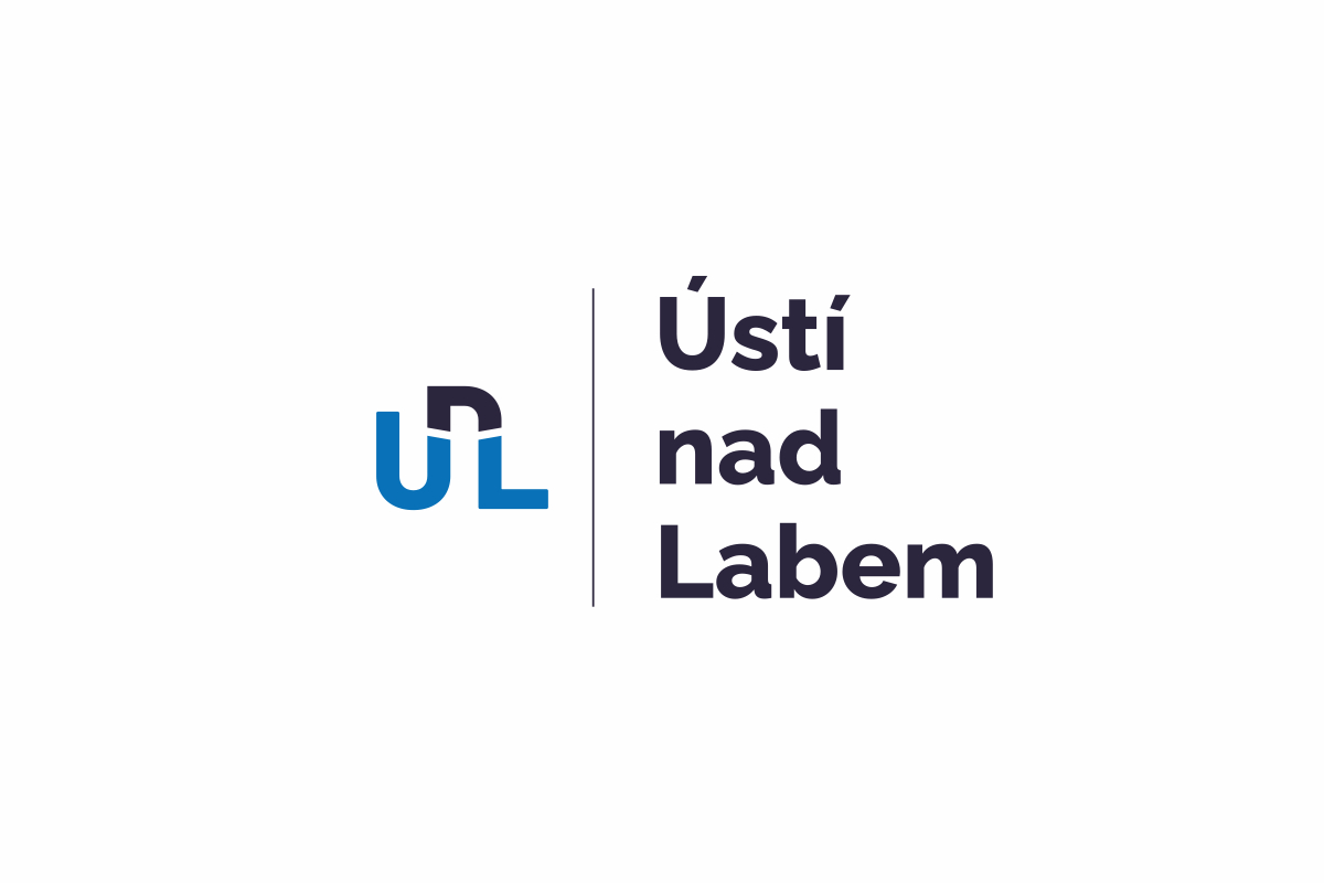
SOUTĚŽNÍ NÁVRH NA NOVOU VIZUÁLNÍ IDENTITU ÚSTÍ NAD LABEM 2021
Ústí nad Labem. Identita v pohybu.
Logo staví na autorském piktogramu UnL, který v sobě propojuje několik vrstev významu: název města, tok Labe, mosty jako symbol spojení i dramatický profil okolní krajiny. V negativním prostoru zároveň vzniká gesto otevřené náruče – město, které vítá.
Primární modrá paleta odkazuje k řece jako určujícímu prvku identity. Celý systém je navržen jako otevřená a škálovatelná platforma: symbol funguje samostatně i jako základ pro městské obvody, organizace a další podznačky v proměnlivých barevných variantách.
Jedna značka. Desítky aplikací. Jasná identita pro moderní město.
en/ Ústí nad Labem. Identity in Motion.
The logo is built around the custom UnL symbol, combining multiple layers of meaning: the city’s name, the flow of the Elbe River, bridges as a symbol of connection, and the dramatic profile of the surrounding landscape. In the negative space, a welcoming gesture with open arms also emerges.
The primary blue palette refers to the river as the defining element of the city’s identity. The entire system is designed as an open and scalable platform: the symbol works independently as well as the foundation for city districts, municipal organizations, and sub-brands through flexible color variations.
One symbol. Dozens of applications. A clear identity for a modern city.